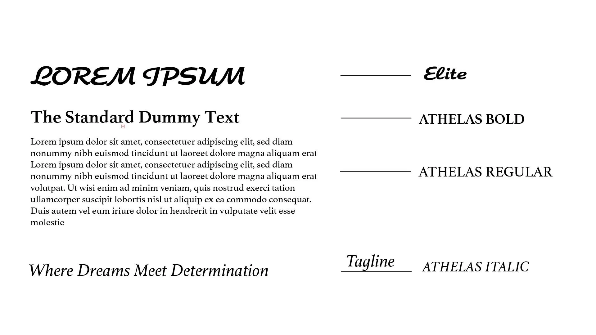
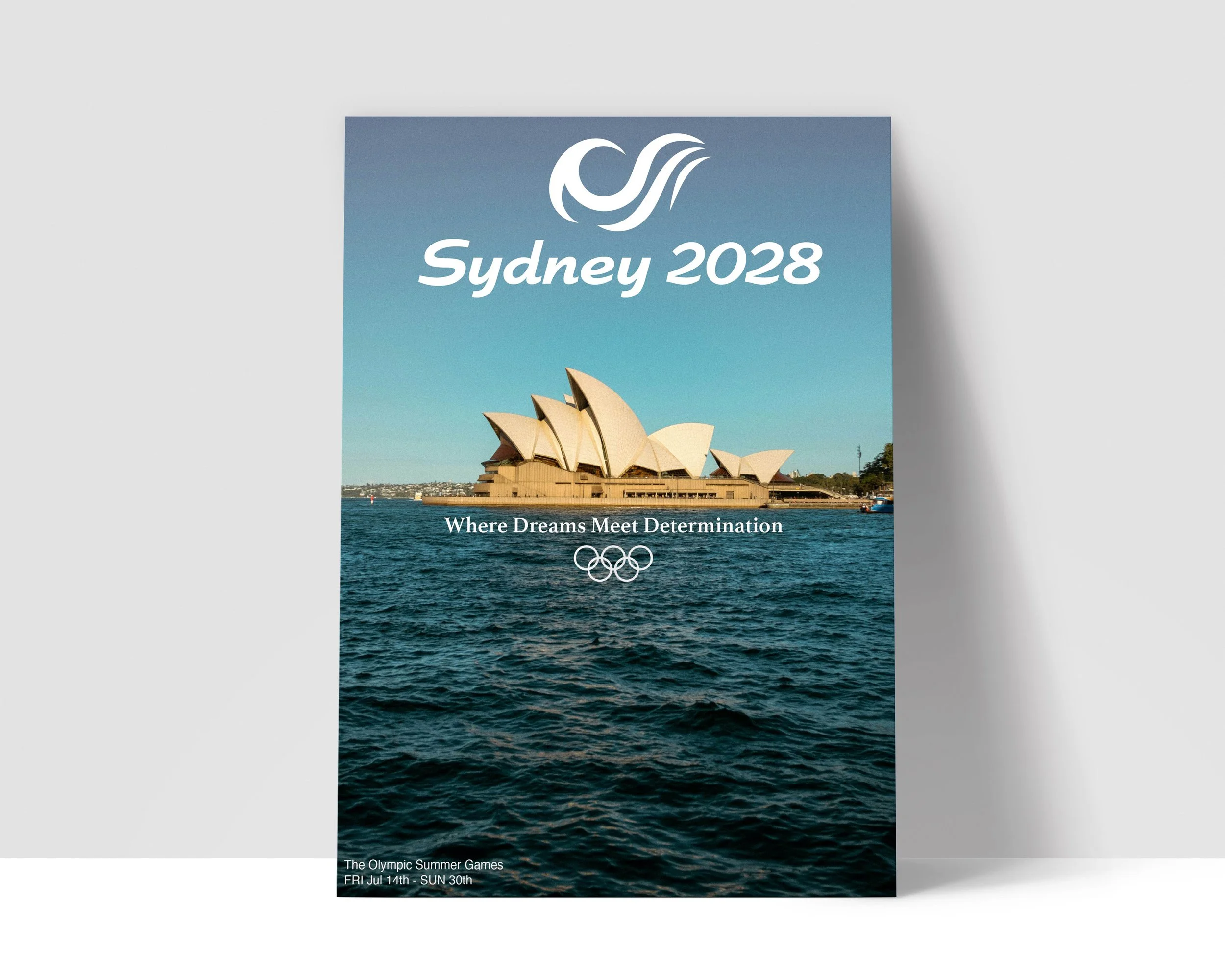
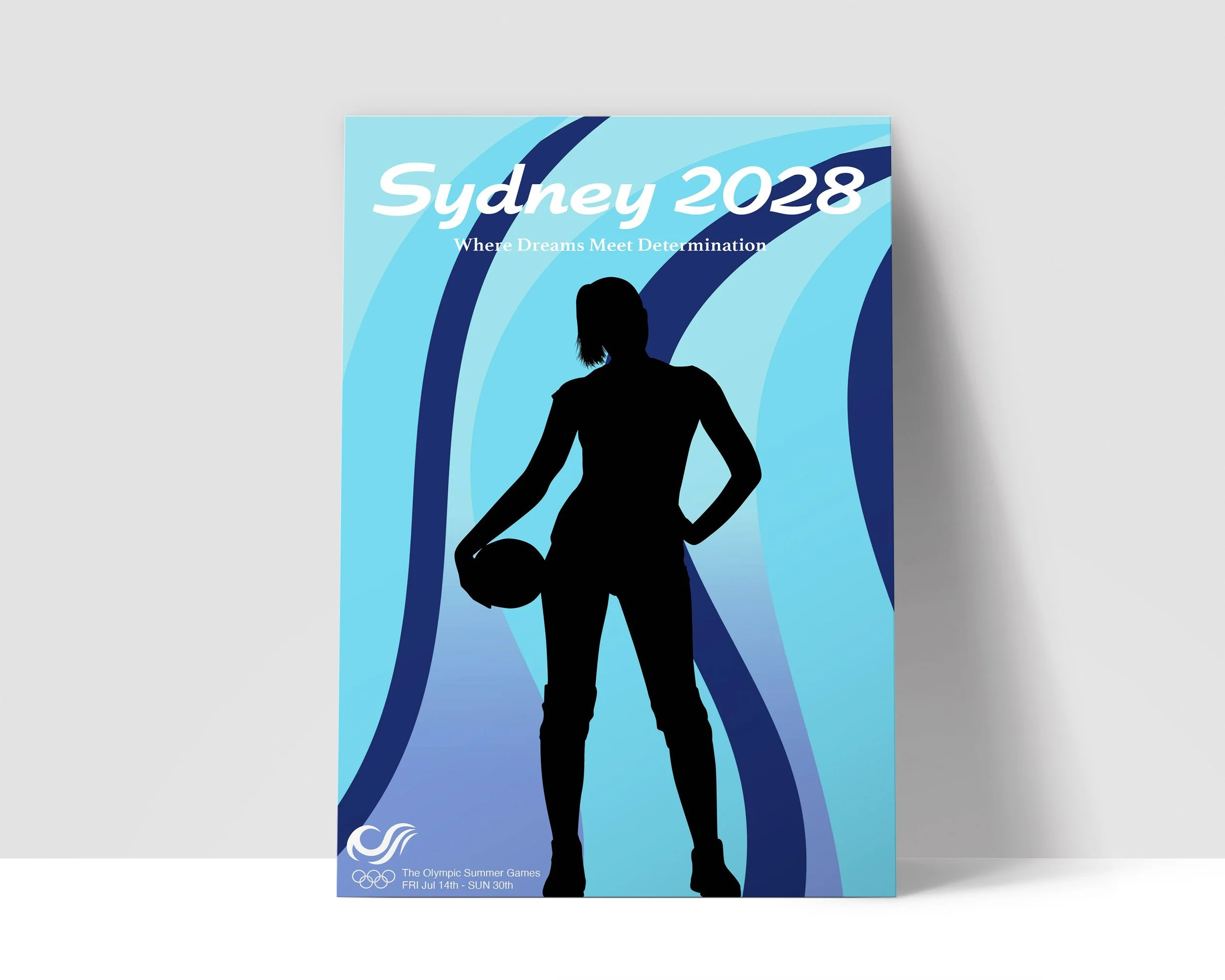
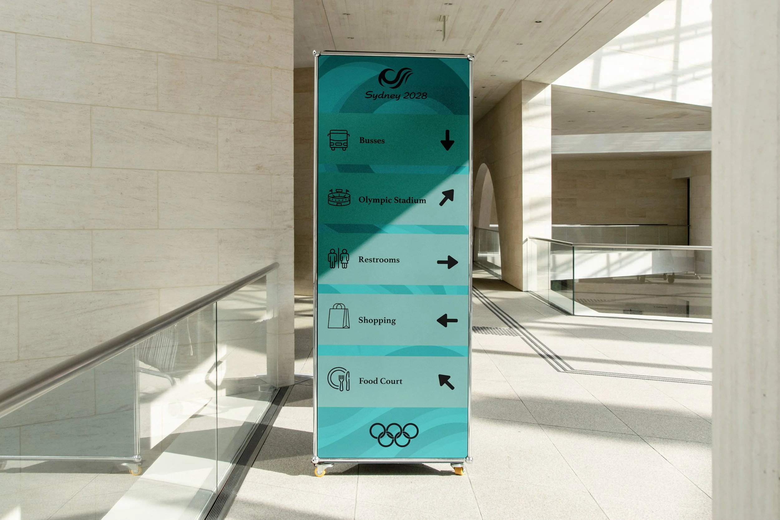
2028 SUMMER OLYMPICS BRANDING
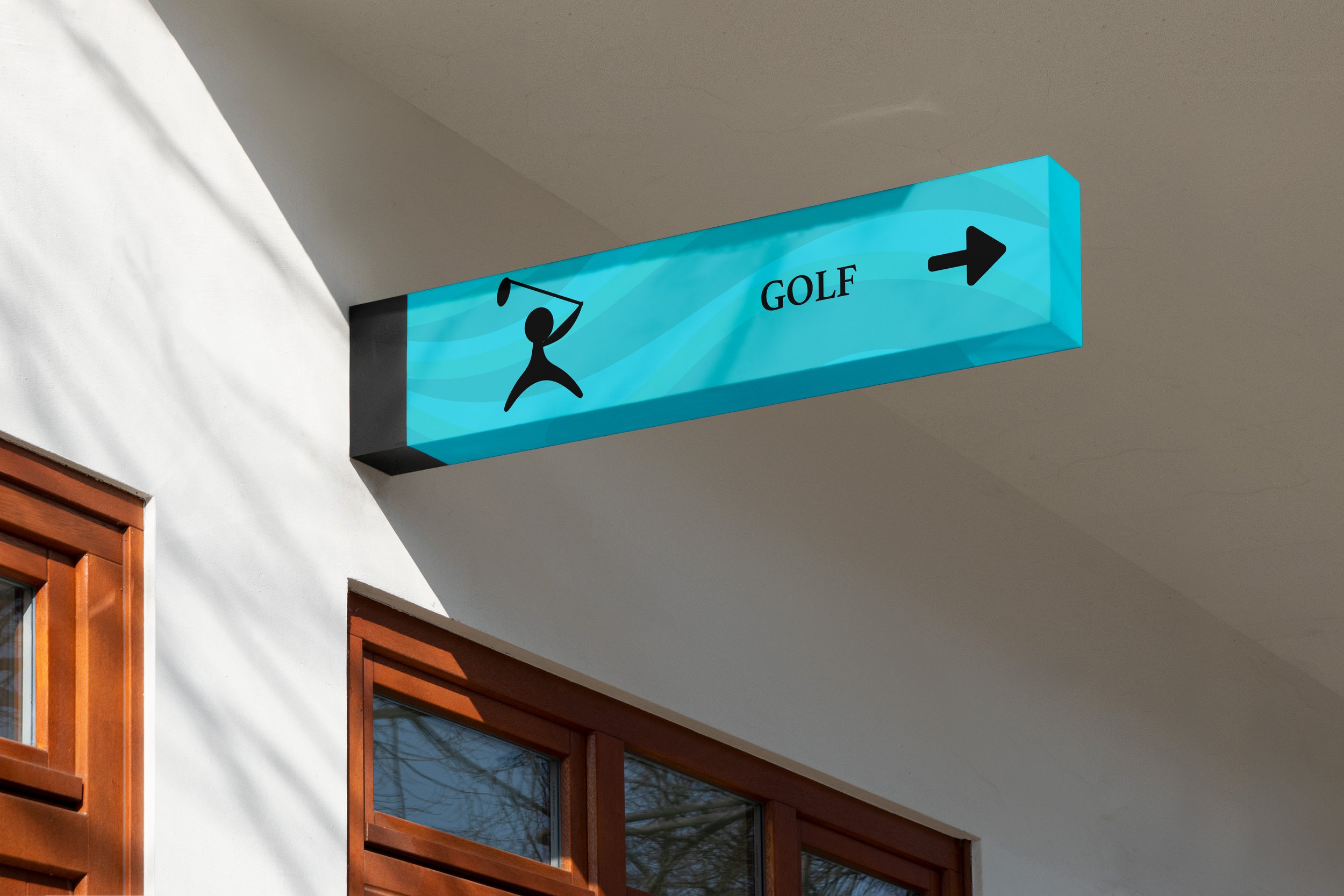
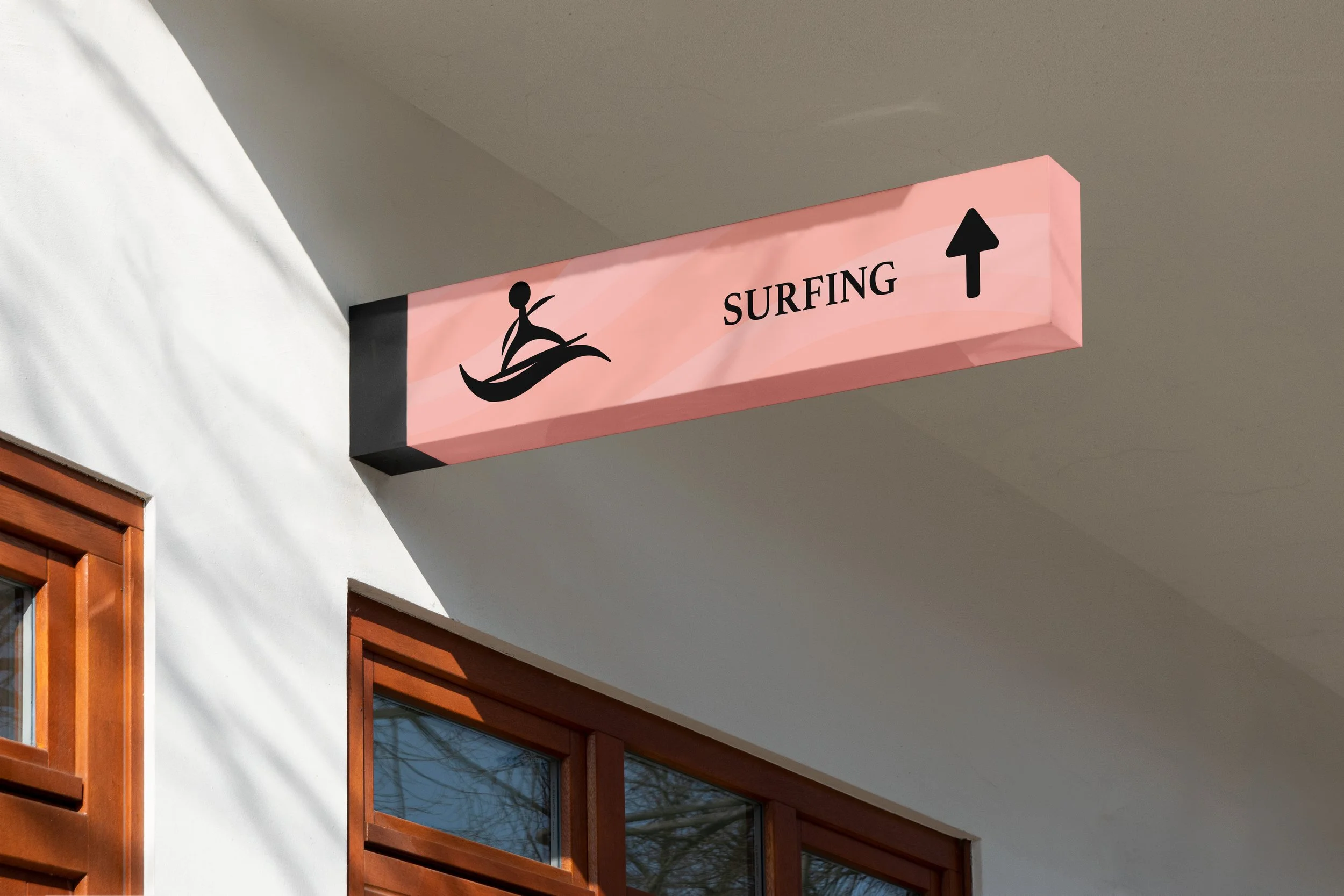
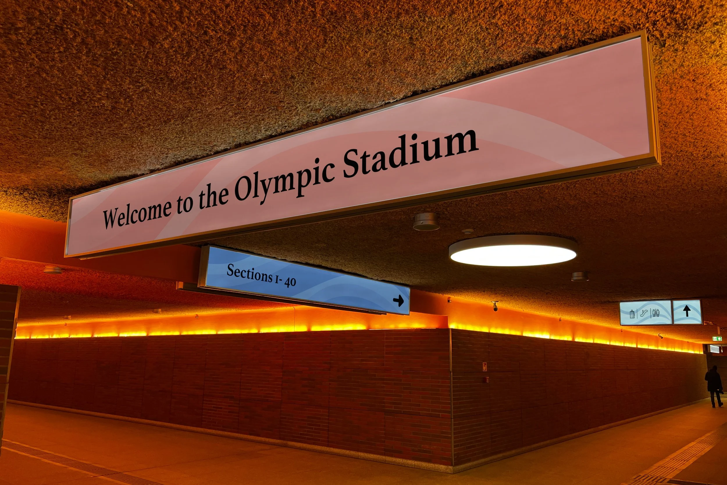
When creating a rebranding for the 2028 Olympics I decided to choses Sydney Australia for the host city. Australia is known for its iconic landmarks, beautiful beaches, and friendly, laid back atmosphere, and I wanted to incorporate these qualities into my branding. I did this by using bright, vibrant colors that reflect the energy and warmth of both the city and the Olympic spirit. I chose a wave like form inspired by Sydney’s strong surfing culture and its deep connection to nature. Surfing is a beloved activity among locals and represents the active, outdoor lifestyle that defines Sydney. The wave symbolizes movement, energy, and unity, core values of the Olympics while also paying homage to the coastal setting of the Games.